Twitter’s Cover Image Template 2014

Get Ready for a Redesign
Twitter is making some sizable changes to the desktop website design of user’s profile pages. The end of an era is upon us; the background image which has been a staple of user profiles since 2007 is going the way of the dodo. In it’s place, Twitter is allowing users to utilize a much larger cover image. The cover image is now 1500 x 500 pixels. It stretches across the width of the page, and is adorned with a cool parallax scroll effect. The user’s profile picture is getting a little more screen real estate as well, but it is still the same square shape as before. The last change is an addition similar to Facebook, in that you can now “pin” tweets to prominently display important ones on your profile.
If we are going down a design highway, this update feels like we’re traveling through an under construction zone. We expect a few more changes to occur over the next couple months. Currently, your background image will still show up on your own home screen, but nobody else will see it anymore. On your profile page, after scrolling down a little, your profile specific navigation bar becomes fixed in place while sandwiching a sliver of your cover image between the user navigation bar and the Twitter main navigation bar. This feel clunky!
Doing Too Much with Too Little
Overall, we love the new design direction that Twitter is taking. The desktop website has never looked better. BUT, they are committing the same design sin that Facebook does with their cover image; they are doing too much with too little. How so? They are using the same cover image on both the desktop and mobile app versions of their service. The smartphone versions of Twitter’s website is designed completely different from their desktop website, and rightfully so. Yet, the tools they give businesses, artists and organizations to brand themselves are disproportionately rudimentary. A single cover image that is used across desktop and mobile is not enough. Check out these screenshots from Full Sail University’s profile:
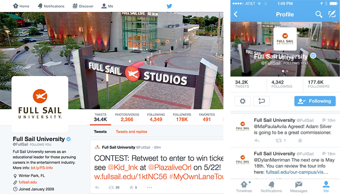
As you can see, this cover image is perfect for the desktop website pictured on the left. But the iPhone app display is a mess. The words in the image overlap the overlay text, and the dynamic feel from the desktop version is just lost here. Twitter does some interesting things with the cover image on the mobile app though. When you pull down, it zooms the image and creates a gaussian blur effect. Also, while we were creating a Twitter cover image template, we noticed that the iPhone app has a VERY subtle parallax tilt effect on the cover image. This effect is so unnoticeable, that it becomes a point of frustration for designers. Your 500 pixel high cover image isn’t displayed at 500 pixels. For the most part, 380 pixels is what the average desktop user might see. That’s almost 25% of your image that won’t be readily viewable. The excess is saved for obscure resolutions people maybe using and for that parallax scroll/tilt effect. On the iPhone version, the image is so heavily cropped (especially on the left and right sides) that you only see 51% of the 1500 x 500 pixel cover image you upload.
Our Twitter Cover Image Template
You should think of this as a stop-gap measure or Band-Aid. Until Twitter (and Facebook) start offering mobile-specific branding features, this cover image template will have to do. We’ve included a Photoshop, jpeg, png, gif, pdf, eps and Illustrator version of the Twitter cover image template for you here:
Download Our FREE Twitter Cover Image Template
Our template is more akin to a safe frames layout used in the film industry. It shows where Twitter cuts off the cover image and how. There is a mobile overlay too, which shows approximately what the cover image will look like on a smartphone. The “Cover Sliver Safe Area” is the tiny sliver that still shows when you scroll down the page to the point the profile navigation bar becomes fixed in place. The reason it is so thick is because the area used differs depending on the size of your browser window (we tested cover images from 1024 pixel browsers up to 2560 pixel windows). We hope this template helps you brand yourself well. Feel free to use it for commercial purposes, and let us know what you think. If you create something, please publish it and let us know. We love seeing what other designers come up with! As always, if you have any questions about the template, please don’t hesitate to ask!