Pinterest Marketing

* EDIT – Friday, February 3rd, 2012 — We are aware of the new pinned image and picture viewing changes recently made to Pinterest. This does affect some of the content in this article, and we’re doing our due diligence to rewrite for the updated rules governing the site *
Pinterest, while experiencing accelerating growth, is a relatively new social network. But, it has historically been the early adopting companies on a social network who reap the greatest benefits of marketing on said network. As Facebook grew, the stipulations and mechanisms by which a company could gain exposure and fans on the network grew more stringent. Perhaps it’s the naivety of the new users who don’t know what they are doing yet, or perhaps the first-in brands become associated with the coolness of the new social space. Whatever the reason, the lesson is simply, “lock-in early!” This article attempts some ideas about marketing on Pinterest, but note that the “newness” of Pinterest means that you will need to be fluid in your marketing plans. Things may change! If you are new to Pinterest or don’t know what it really is, you can read our beginner article on Pinterest to catch up.
Pinboard-based Marketing
So what does marketing on Pinterest look like? Should you recognize it when you see it? That’s a question that will stay on the table—a decorative, cool, DIY table. It seems that Pinterest users are all about discovering something new and unique. It’s a place to break away from the mainstream, or to look at the world in a different light. It’s a place for homemakers to get ideas to warm up their domiciles too. Early on, Etsy.com mini-shop owners found their success was amplified by marketing their handmade products on Pinterest. So maybe there is a market for people who want something unique. Think about your target market, and if they would be on Pinterest and why. If you’ve determined that Pinterest is a good marketing avenue for you to explore, the next step is fashioning your marketing plan in a way that maximizes the potential Pinterest supplies.
Pinterest Max Ratio

Pinterest doesn’t limit the vertical size of images pinned. The horizontal width of pictures does max out at 554 pixels though. The infinite length is great for companies that produce infographics, as most infographics are several times longer than they are wider. I should note that these are the dimensions of the actual pin page image, not the dimensions for the thumbnails seen on a pinboard. And really, any size width will work, but it will be resized and displayed at a max of 554 pixels on Pinterest. With that in mind, it quickly becomes clear that we should work with ratios—not pixels—when developing images for the express purpose of being pinned on Pinterest.
One thing to note is that on a pinboard there are both max width and max height dimensions for the thumbnails. They are 192 x 600 pixels. This creates a 32 x 100 pixel ratio in order to keep a vertical letterbox effect from occurring. So if your picture is 400 x 600 pixels no vertical letterbox would be created, but if it was 400 x 1300 pixels a slight vertical letterbox effect would be applied to the left and right sides of the thumbnail. The “letterbox” is transparent and unnoticeable, but you start to get in trouble when your image is much, much longer than it is wide. You can’t tell what the image on the right is about by looking at it. It’s actually an infographic about the most expensive cities in which to live in the world, but the title at the top is too small because the sides are cut off. Hover over it to see how much screen real estate is lost by this lopsided ratio.
A solution to really long content, is to break the image into several images. For Pinterest users, this would be a great reason to click-through to your website to see the rest of the infographic. At the bottom of your image, you may even leave a small message like, “Read the rest of this infographic at http://huebris.com/EXAMPLE.” On the actual webpage for the pinned content, you could simply give the cropped Pinterest version of the image an absolute position via CSS and a z-depth that is under the full-length image. Since this is a workaround, people visiting your site won’t be able to see the cropped version to pin it for themselves though. But if the image is the first one listed in the code, it may show up first when people try to pin the url manually on Pinterest. Currently, there is no tag you can include in your webpage to specify which image you want to be the default for users pinning your page to Pinterest. Facebook has a feature like this through meta-properties tags, where you can specify the og:image that will be generated when someone shares your website URL on Facebook. Hopefully Pinterest will follow suit sometime soon. Right now, it’s hard to specify which image will be the default, and if you embed a YouTube or Vimeo video on that page, it will take precedence over any image.
Pinterest and the Golden Ratio
Usually we tell clients to work within the maximum screen space available to them. But if everyone did this on Pinterest, it would create quite a uniform grid for a pinboard. Not only that, some images might not need to be 192 x 600 to get the marketing message across. We suggest using the Golden Ratio, or approximately 1.618, when creating images with Pinterest in mind. The Golden Ratio is based on the Fibonacci Sequence which is seen in nature everywhere. The Golden ratio can be seen in proportions across the human body too. Repetition is a strong psychological influence, and since nature has done the leg-work here, try using the Golden Ratio to see if it makes your content pop against all the other pins vying for people’s attention.
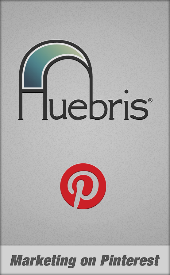
For an image that is exactly 544 pixels wide, a good height would be either 896 pixels (for a greater height) or 342 pixels (for a greater width). These two sets of dimensions are in sync with the Golden ratio. We’ve made the example below to illustrate an image created at 554 x 896 pixels. You can also see it illustrated on Pinterest on the Huebris Blog Board.
Other Considerations for Marketing on Pinterest
We want to leave you with a few other takeaways from this article, so here they are:
- Be sure to use larger text sizes in your images. If it’s important, it should be readable in the 192 pixel-wide thumbnail version of the pin.
- If you use a border in your picture, make sure it doesn’t insulate your image on Pinterest. Gestalt principles of design show that borders create order. Well, Pinterest already creates a border, and their is an implied border from the margin space. Do you really need to add another one? It may work, but keep this concept in mind!
- Use the viral nature of Pinterest to your advantage. Create a seed-list of people you can count on to re-pin your content, and @-tag them. Pinterest supports @-tagging the same as Facebook and Twitter. You can even tag followers in the description.
- We’ve mentioned this before, but Pinterest supplies “Pin it” and “Follow Buttons” like most major social networks. You can get the code to install them to your site on the Pinterest Goodies page. Calls to action from your website will boost your following on Pinterest, and bring subsequent traffic back to your website later.
Wrapping Up
We hope this has been an informative look at the basics of Pinterest marketing. If you need more assistance planning a Pinterest marketing strategy, or if you have any other questions, contact us today!

