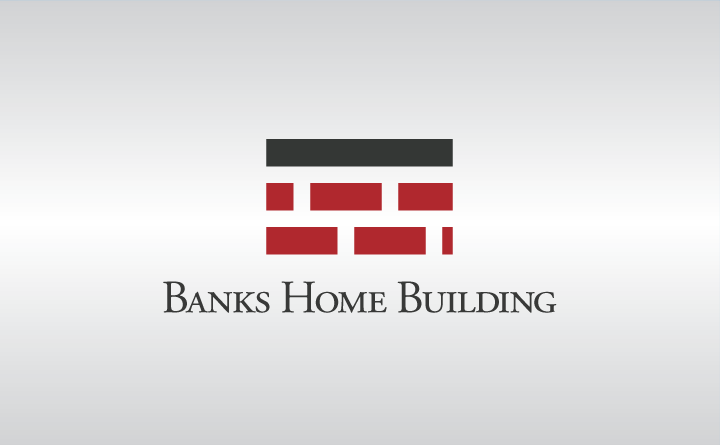
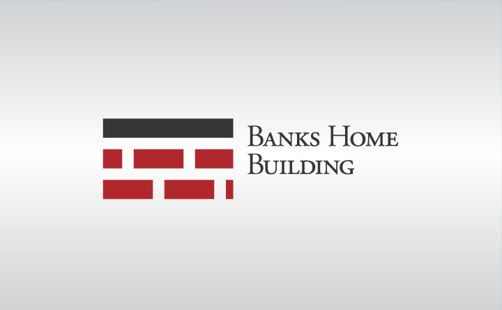
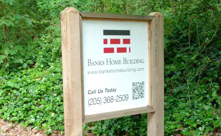
Banks Home Building is a staple of the Mountain Brook community and the greater Birmingham area. In fact, if you take a drive through Mountain Brook, you’ll probably see a few BHB signs in front of new construction projects. And on those signs you’ll now see a new logo designed by Huebris. For this client, we wanted to convey the message of quality that is apparent in every project Banks Home Building completes.
Taking inventory of the current standards and practices for logos and branding in this industry, we quickly noticed a trend. In our research, we found hundreds of logos from competitors that all used profiles and silhouettes of homes. Usually, they were a few walls and a roof, with the name of the business somehow sandwiched in the middle. And this trite treatment was the apparent industry trend. We decided that this model isn’t effective for establishing a brand or sending any kind of real message. The blueprint used by everyone else is so formulaic, no one using it has the opportunity to truly stand out. It’s so prevalent, the design is used almost satirically in the show “Arrested Development” by the protagonist family’s business, the Bluth Company.

With the knowledge that the old way was saturated, overdone and quickly becoming nothing more than noise, Huebris broke away from the established normative design progression. A logo should speak more about a company and its brand than what they do. It should send a message about how they do it, or why they get out of bed in the morning to do it. The old message used by countless companies is, “We build houses.” It was clear we needed to create a better message than that.
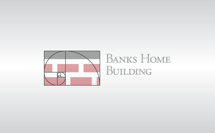
We decided to take brand narration and logo design in the direction of Banks Home Building’s strengths, and one of the dominant characteristics of working with them is their standard of quality. Quality can be an almost intangible thing to convey; you know it when you see it, but have trouble expressing why. We saw the trouble with using the profile of a home in a logo. It simplifies the domicile too much, and makes your home just another project to the developer—nothing special. Quality isn’t achieved by viewing the forest for the trees; it is in the details. It is earned by the choice of material, and it is laid brick by brick. So we put home building under the microscope. The logo is so precise in design that the bricks used are numbers from the Golden Ratio and Fibonacci Sequence.
Let’s face it, you want your home to be a unique place. It is much more than four walls and a roof. The product of Huebris and BHB truly thinking outside the box, left us with seven little boxes that that speak volumes more than the tried-and-true, hackneyed logos prolific to the home construction industry today.