Facebook Profile Pictures

Over 250 million photos are uploaded to Facebook every day. A picture is worth a thousand words, and on the world’s largest social network they are worth 120 – 180% more engagement with your posts. You may or may not have noticed that Facebook is rolling out a new photo uploader that makes posting them even easier! Similar to how you can add details to a video while it is uploading on YouTube, Facebook users will be able to do the same while uploading albums. But despite the improved, easier and streamlined image uploader, there are still tons of factors to consider when publishing your pictures to Facebook. We’ll go into these, and talk about the many different places users can see published images, but first let’s go over the ubiquitous “Profile Picture.”
The Profile Picture
Getting this image correct on your fan page is crucial! As you set up and brand your fan page, you can decide which landing tab fans default to, but they will always see the profile image. And, whenever you post under this fan page, your thumbnail will also be seen. This means that for every visit to your fan page, every post view and every other picture shared, your profile picture will be seen.
Dimensions
I won’t harp on this too much because the dimensions of the profile picture can change at Facebook’s whim. Currently they are 180 x 540 pixels. This doesn’t mean you have to make your picture that exact size! On the contrary, make them much bigger. You never know when Facebook may change things up again, and they actually save your image at larger dimensions; then they create a version that is compatible with their current rules. Proof of this can be seen when Facebook upgraded images from a 720 pixel maximum to a 2048 pixel maximum. People who had originally uploaded larger images than could be displayed were pleasantly surprised to see them in their full resolution after Facebook’s update. Plus with company logos, larger images that are scaled down seem to display fewer artifacts.
File Type
Artifacts occur when Facebook compresses your image to a jpeg version it hosts on its servers. Facebook knows that not everyone is computer-savvy enough to compress their images and save bandwidth, so they do it for you. Unfortunately, the product of this compression is a bit lackluster at times. Small images and the wrong image file type can lead to artifact-laden profile images, and even major brands are guilty of this:


Gross! See all the weird garbled mess in what should be solid solors? Those images are exactly 180 pixels wide, and were most likely compressed twice. Double compression will always lead to increased artifacts. Saving any image as a JPEG technically will compress it (even it you save it at 100% quality). That’s why you should always use a lossless file type when uploading images to Facebook. The one we use the most at Huebris is PNG. Try it, you’ll like it! Oh, and don’t expect your image to look perfect the second it is posted to Facebook. For some reason, while they spread your image to all their servers, a temporary, ugly, low-quality jpeg is put up on the page. We worked tirelessly on finding the perfect workflow for publishing the highest-quality images, only to find out that those images don’t display immediately. Be patient, use PNGs that are bigger than necessary, and your profile picture will be fine!
Mind the Gap
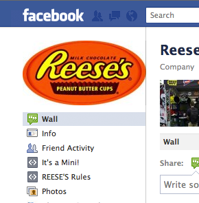
 You’d be surprised how many people miss this, but leave enough room around your image to pad it appropriately. Look at the profile page after uploading to see if you’ve left enough room. If your profile picture looks like this one from Reese’s, you’re doing it wrong.
If the image is 180 pixels wide overall, maybe create a safe frame of 160 pixels to give a 10 pixel buffer on either side. Also be sure to give ample space above and below the logo so that it isn’t pressed up tightly to the sidebar navigation. Padding your logo will also help with the profile picture thumbnail.
The Profile Picture Thumbnail
The thumbnail of your profile picture is seen every time you post something to Facebook. However, many companies miss the opportunity to adjust it. Make sure it looks good, and fits well enough to reinforce your brand or product. To adjust it from your profile page, click “Edit Page” on the right, and then click “Profile Picture.” Look for “Edit Thumbnail,” and from there you can drag it around, and even scale it to fit the box. In some cases, companies use such a vertically long profile picture that it doesn’t look good as a thumbnail. A workaround to that is to make them even longer, putting a squared-out section at the bottom that exists only to be turned into a thumbnail. Check out these good examples:

Be Creative
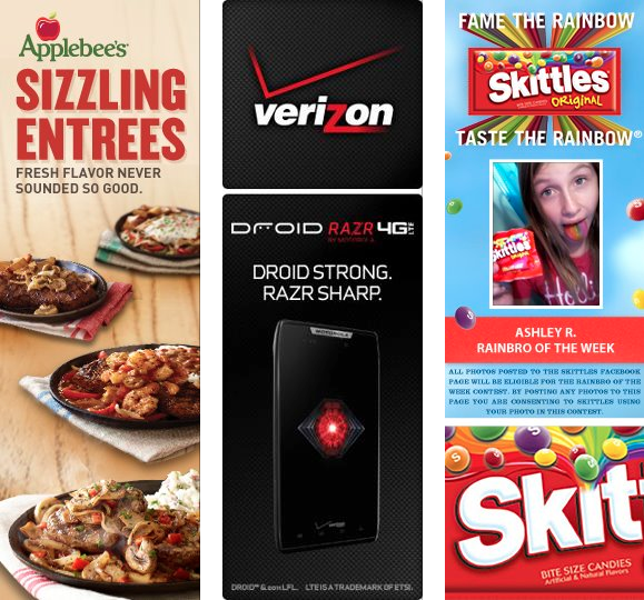
Humans both hate and love limitations and restrictions. Creativity is born many times out of disrupting the system. After all, it takes a truly creative person to find a way to abide by all the rules and yet still create something original. Most of the time, this is achieved by maximizing what little has been given to you. In this case, larger messages can be displayed on vertically longer profile pictures. The width will always be 180 pixels, but the height can be anywhere up to 540 pixels. Check out some of these gems:

These go from good to great. Applebees shares its message of sizzling entrees very well, but they don’t leave much room for Facebook to crop out a descent thumbnail from it. Both Verizon and Skittles have a part of their profile picture sectioned off just for their thumbnail. Verizon showcases its phone, but very impressive is the way Skittles turned their profile picture into something truly social by allowing people to become the “Rainbro” of the week. This encourages fans to post content to their Wall, and in turn exposes all their friends to Skittles’ fan page—it’s genius!
