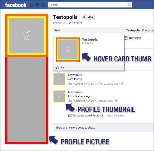
Free Facebook Profile Picture Template

Since writing our do’s and dont’s article on Facebook Profile Pictures, we’ve had a lot of people asking for a template to help make designing their own fan page profile pic easier. In response to this request, you can download that template in PSD (Photoshop) format here:
Download Facebook Profile Picture Template
Once you get into the file, you’ll notice a couple of things. The file basically has five different zones that will help shape your fan page profile pic design. I’ll talk about each of them quickly.
1) Safe Frame Border
 For this template, I used the maximum dimensions Facebook will allow on a profile picture (180 x 540), and I multiplied that by two. Why multiply by two? Bigger images degrade better than images that fit the exact dimension constraint set up by Facebook—even Facebook acknowledges this. However, most businesses use exactly 180 x 540 pixels. If you want to go the exact route for some specific reason, hit Ctrl+Alt+I on a PC or Cmd+Alt+I on a Mac to resize. Set it to 180 x 540 pixels or use percent and set it to 50%. Under Resample Image, use Bicubic Sharper (Best for Reduction).
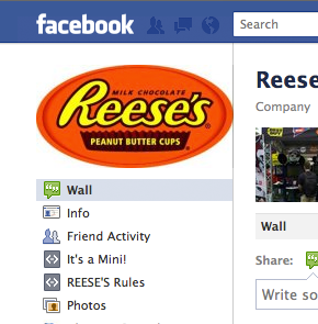
The Safe Frame Border is the red area on the template. I recommend that you keep all text inside this border. This is a precaution to keep your profile image from butting up against the design of Facebook. Take Reese’s for a bad example. See how their logo hits the right holding line on Facebook? The red Safe Border Frame Layer will prevent this kind of issue from happening.
2) Promotional Content Area
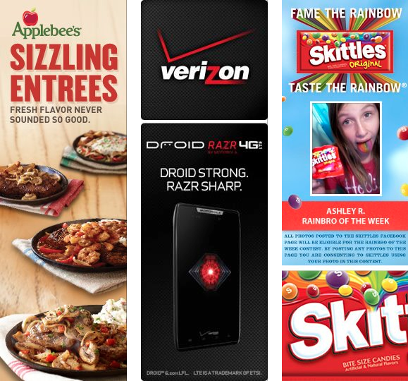
This is where you can blast whatever marketing effort you are focused on currently. Talk about your company, or talk about your product. Talk about a sale you are having. Talk about a Facebook promotion/sweepstakes you are doing to gain more fans. A lot of companies make profile pictures that only show their logo, and that’s fine. But this template is designed to take advantage of all the screen real estate supplied to a fan page by Facebook. Take a look at what these brands did with that space:
We should note that you don’t have to align your logo to the top of the profile picture like in this template. In fact, we purposefully grouped all the logo areas and safe frames so that you can move it vertically to any spot in the picture. In Photoshop, select the “LogoGroup” layer, hit the hot key “v” on your keyboard, and click and drag the logo area to any spot that pleases you. Your logo can go in the middle or anywhere, but usually companies align it to the top or bottom so as not to break up their promotional area. And technically, your logo doesn’t have to go in the logo area. If a new product is what you want everyone to see, as long as it fits in the logo safe area, go for it! We would only do this after gaining a large fan base who understands your brand and Facebook presence though. Logo’s are important to a business for a reason.
3) Logo Safe Area
The Logo Safe Area is the exact area in which you should fit your company logo. Of course, don’t stretch your logo if it’s wider than it is higher. Just let your logo fit from end to end within this gray box. That’s really all that needs to be said about this area. Place what is important here. It will accompany almost every action you perform on Facebook.
4) Thumbnail Safe Frame Border
This area is designed to give the thumbnail of your logo a little bit of padding. If you created a border around your logo, it would be cropped inside this area, which is not recommended. We would suggest leaving this area clear of any major design elements if possible. The Thumbnail Safe Frame Border is the yellow frame in the template.
5) Hover Card Safe Frame Border
Almost everyone forgets about the Hover Card. This is the card that pops up whenever a Facebook user hovers over a profile picture thumbnail for a second or more. It’s easily forgotten when designers start thinking about creating a profile picture. We designated this area with an orange frame in the template. Once again, it is recommended that you don’t place any text in this area. A soft background gradient, or something similar in nature is more appropriate for this safe frame.
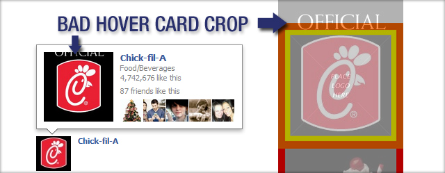
We feel that Facebook should offer fan page admins some control over this, or at the very least, a reminder of what it will look like when uploading a new profile pic. In the meantime, just be sure to keep this buffer area clear of major design noise or text that would be cropped off. Take the Chick-fil-a image above as a reference.
If you move any of the logo safe frames or the logo area, be sure to move them all the same distance, and only move them vertically. This has already been mentioned, but be warned that if you move them horizontally or break them up, your final image will most likely not be the desired result you wanted on the social network. Below is an image of the template, and it shows what the thumbnail looks like as well as the Hover Card:
Wrapping Up
We hope this Facebook profile picture template helps you on your way to designing a profile pic that degrades nicely across all your fan pages. If you have any questions or comments, contact us, and we’ll try to reply quickly to them. For your reference, this kind of work generally falls under the social arm of our Cloud Branding service. If you need help, or would like a FREE consultation, just give us a call or an email.
